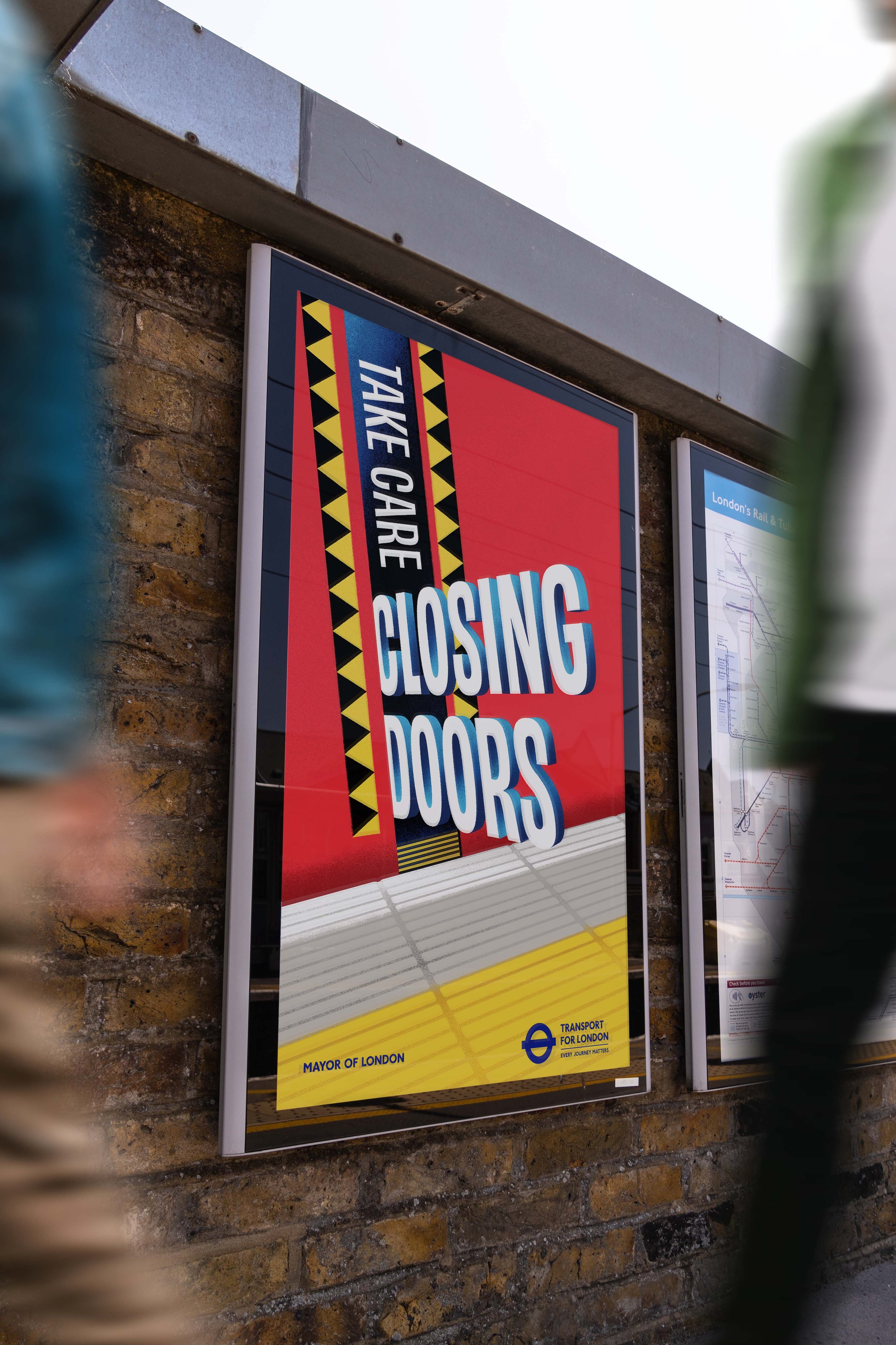
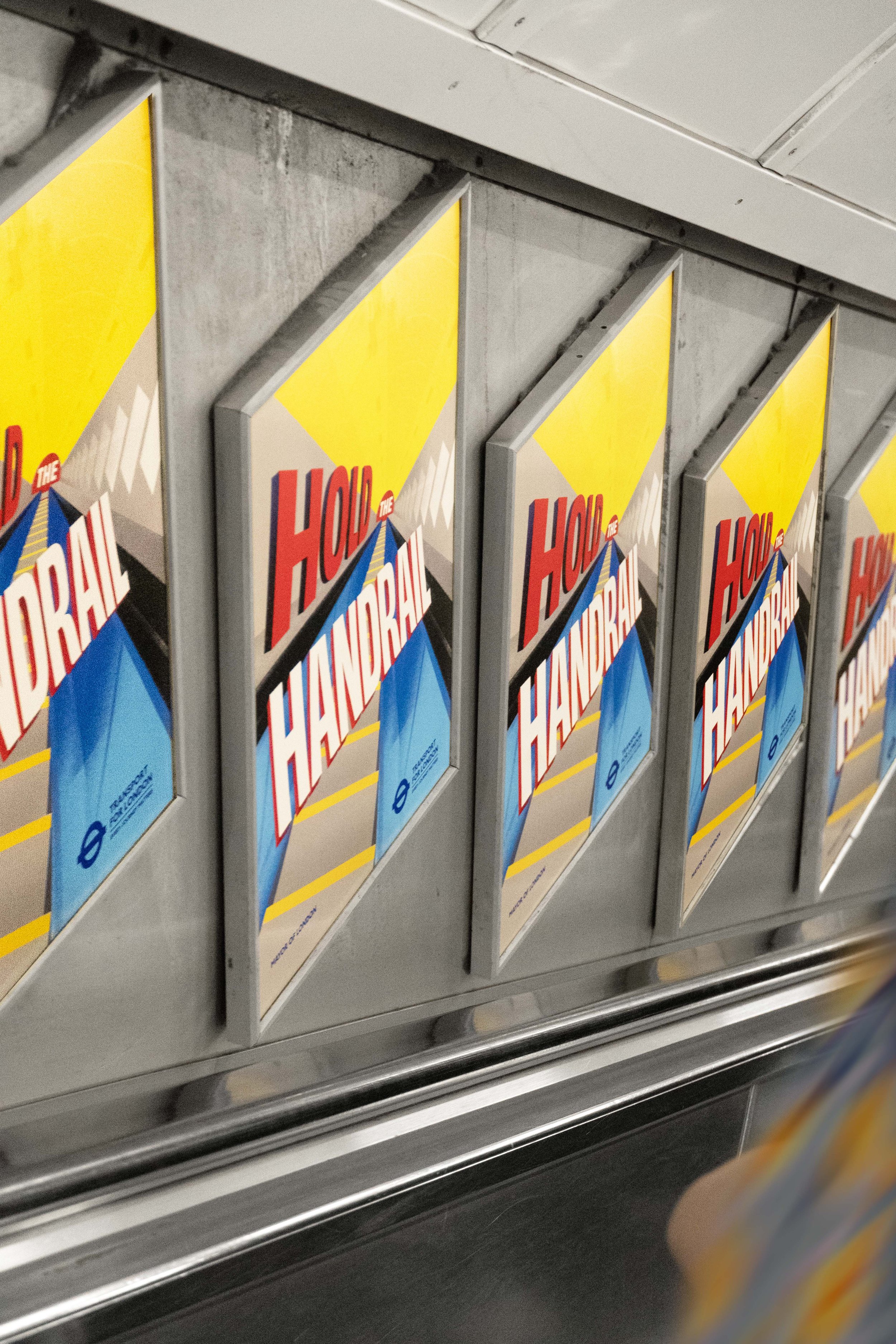
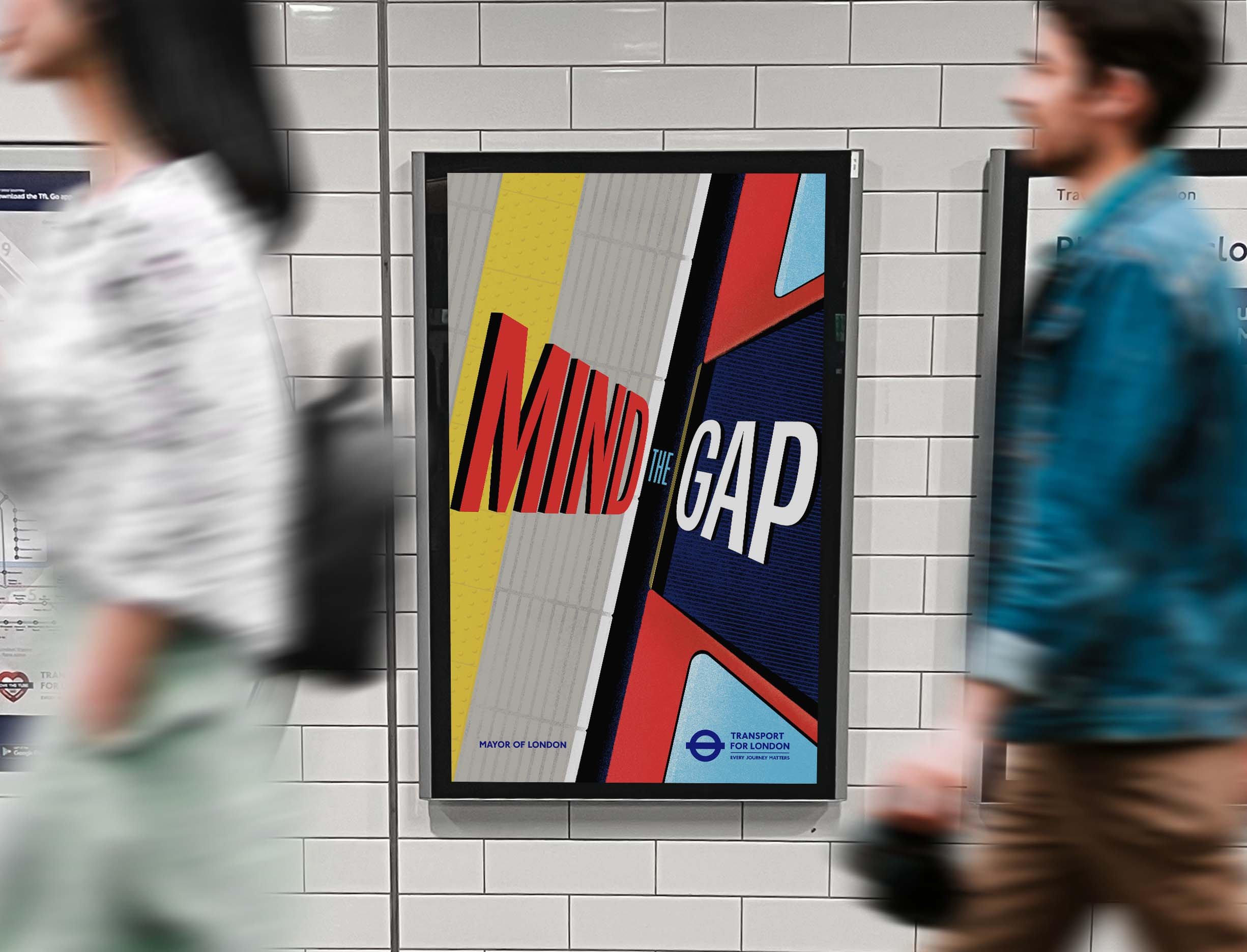
Transport for London wanted to make sure their latest safety campaign stood out. VCCP agency asked me to bring my unique eye for brave composition and colour to the iconic messages of London’s transport network. The bold reductive graphic shapes combined with a bright primary colour palette and obscure perspective typography made sure that these posters grab attention amidst a sea of adverts and busy commuters. Integrating the unique patterns and textures of the networks tiles, grip marks and hazard icons ensured the suite of posters felt unique to The Capital’s iconic rail and bus network.